The Visualization
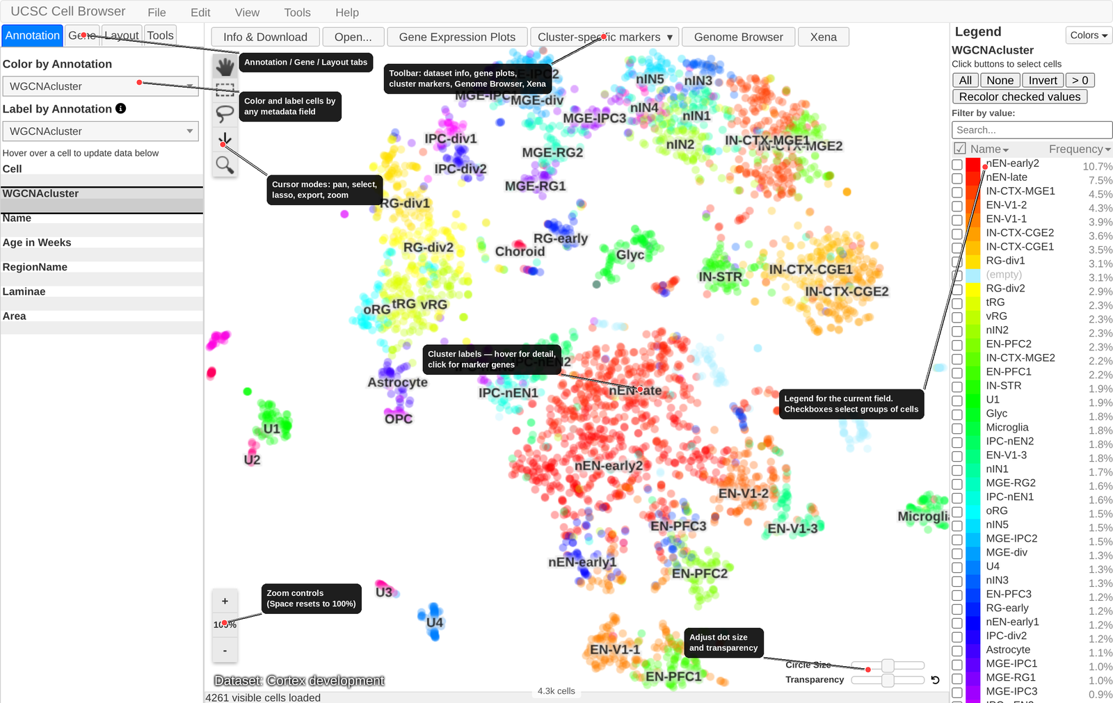
Once you open a dataset, you will see the core visualization with these main areas:
- Left sidebar
Contains the “Annotation” and “Gene” tabs for controlling how cells are colored or labeled.
- Center scatter plot
The primary 2D layout (typically tSNE or UMAP, though sometimes spatial images too). Cells appear as dots, colored by the currently selected annotation or gene. Clusters are labeled according to the currently selected field.
- Right legend
Shows the color key for the current field used for coloring. Color key can be sorted alphabetically or by frequency. Use the checkboxes to select large groups of cells.
- Top toolbar
Contains menus (Edit, View, Tools) and links to dataset information, layout switching, and external resources.
- Bottom heatmap area
When enabled, shows an expression heatmap of dataset genes across clusters (see Cell Selection, Comparison, and Heatmaps for details).
Cluster Labels
Many datasets display cluster labels directly on the scatter plot. Hover over a label to see additional details such as top marker genes or the full name behind an acronym. Click a cluster label to bring up a pop-up list of marker genes for that cluster (see Marker Genes from Cluster Labels below). Use the “Label by Annotation” drop-down menu under the “Annotation” tab to change the field used to generate the labels.
Switching Layouts
If a dataset provides multiple dimensionality reduction results (e.g. both tSNE and UMAP), you can switch between them using the layout dropdown in the top toolbar. You can also change the size and transparency of the dots.
Coloring by Metadata
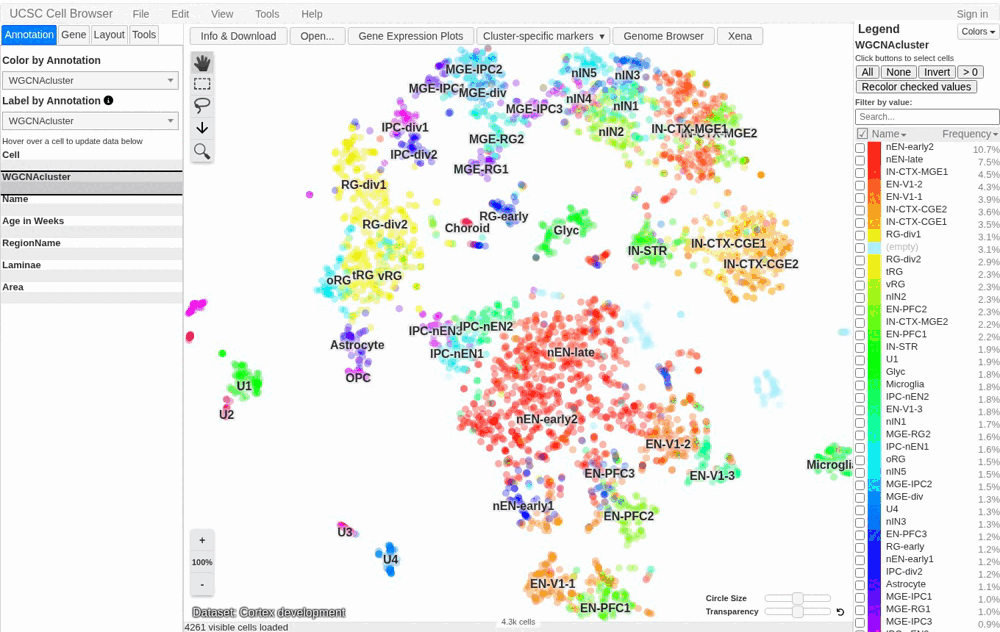
The Annotation tab in the left sidebar lists all available metadata fields for the current dataset (e.g. cluster name, cell type, donor age, sample origin). Click any field name to recolor the scatter plot by the values in that field. The legend on the right will update to show the color assignments.
Tip
Use the “Recolor checked fields” button in the legend to highlight only specific values of interest. All other cells will be colored grey.
Coloring by Gene Expression
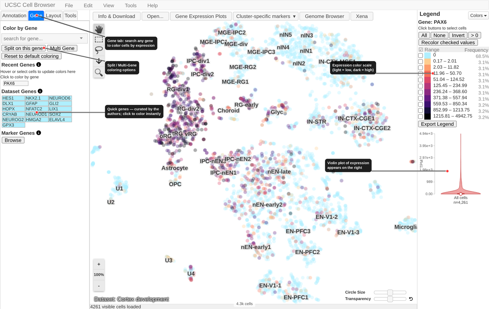
To color cells by gene expression:
Click the Gene tab in the left sidebar.
Type a gene symbol into the search box.
Select the gene from the autocomplete list.
The scatter plot will recolor using a gradient from light (low expression) to dark (high expression). The legend will show the expression bins and their associated colors.
You can also recolor instantly by clicking a gene in the Dataset Genes table on the Gene tab, as shown above — a quick way to page through a set of markers without retyping each name.
Multi-gene Coloring
To color cells by the expression of multiple genes:
Click the “Multi Gene” button under the Gene tab.
Enter a list of genes, either as one per line or a space/comma separated list.
Click “Load the genes below”.
The scatter plot is then colored based on the summed expression of those genes.
Quick Genes
Many datasets include a curated list of quick genes, which are genes the dataset authors consider particularly important or informative. These appear as a clickable table below the gene search box. Click any gene name to instantly color the plot by its expression.
Marker Gene Database
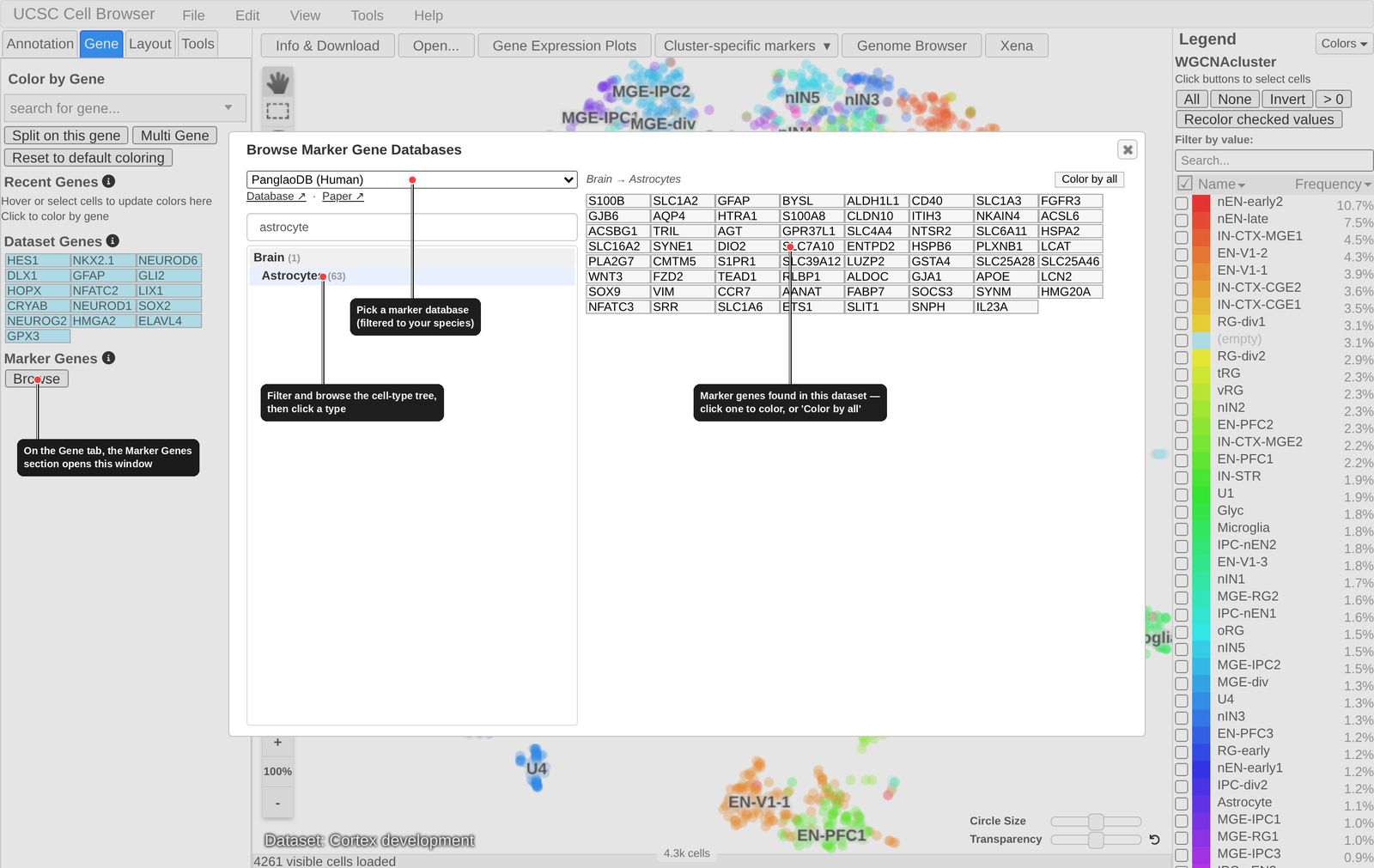
The Marker Genes section at the bottom of the Gene tab lets you look up known marker genes for a cell type from curated public databases (such as CellMarker 2.0 and PanglaoDB) and color the plot by them — a quick way to see which clusters express the canonical markers of a given cell type.
If marker databases are available for the dataset’s species (currently human and mouse), a Browse button appears. Click it to open the Browse Marker Gene Databases window:
Choose a database from the dropdown. Only databases matching the dataset’s species are listed, with links to the source database and its publication shown just below.
Find a cell type by typing in the filter box, or by expanding the tree of cell types (grouped by tissue where the database provides it). The number next to each cell type is how many of its marker genes are present in the current dataset’s expression matrix.
Click a cell type to list its marker genes on the right (only genes found in this dataset are shown). Click any gene to color the plot by its expression, or click Color by all to color by the summed expression of the whole set.
Note
This is different from Marker Genes from Cluster Labels below: that shows marker genes computed for this dataset’s own clusters, whereas the Marker Gene Database looks up known markers for a named cell type from external, curated databases.
Marker Genes from Cluster Labels
If a dataset includes marker gene annotations, clicking a cluster label on the scatter plot will open a pop-up table of marker genes for that cluster, sorted by p-value by default. You can:
Click a gene symbol in the first column to recolor the plot by that gene’s expression.
Click a “genome” link (if available) to open the UCSC Genome Browser centered on that gene.
Sort by any column (p-value, enrichment, etc.) by clicking column headers.
Changing Color Palettes
The Cell Browser includes several built-in color palettes. You can switch palettes using the palette selector in the legend area. The URL will update to reflect your choice, so palette selections can be shared via URL.
Gene Expression Plots (Dot Plots)
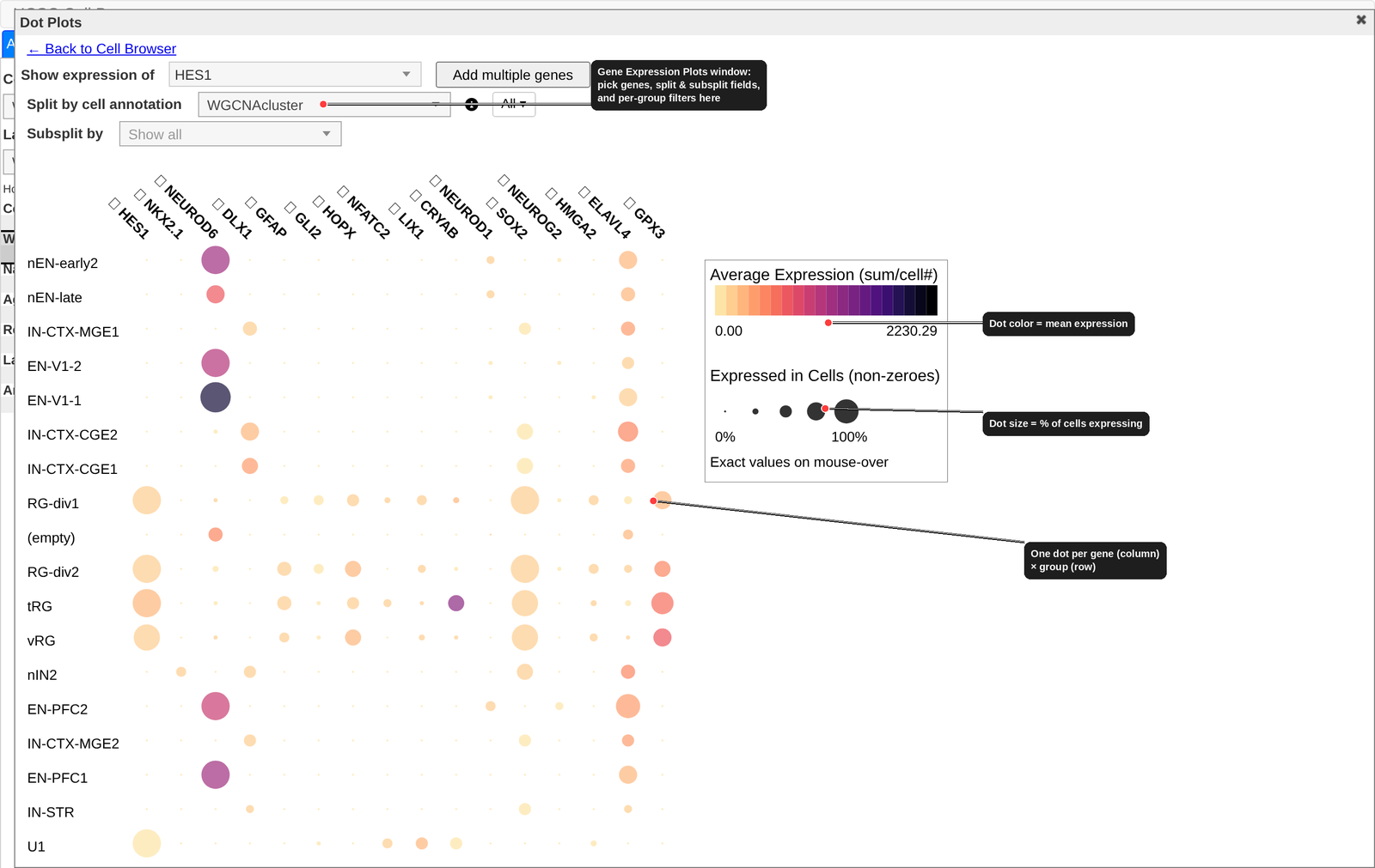
The Gene Expression Plots button in the top toolbar (or on the Gene tab) opens a dedicated window for comparing expression across groups of cells. When you open it, the dataset’s quick genes are loaded automatically as a dot plot:
Each row is a group of cells and each column is a gene.
Dot color encodes the mean expression of that gene in that group.
Dot size encodes the fraction of cells in the group that express the gene (the non-zero fraction). Hover over any dot for the exact values.
You can shape the plot with the controls along the top:
- Show expression of
Pick a single gene, or use Add multiple genes to enter a list.
- Split by cell annotation
Choose the categorical field that defines the rows (e.g. cluster, cell type, sample). Numerical fields cannot be used to split.
- Subsplit by
Optionally cross the split field with a second categorical field — for example, split by cell type and subsplit by disease status to compare the same cell types across conditions.
Each of the split and subsplit controls has an All ▾ filter button next to it, which lets you restrict the plot to a subset of that field’s values instead of showing every group.
Click ← Back to Cell Browser or the close icon to return to the scatter plot.
Spatial Transcriptomics Data
The Cell Browser supports visualization of spatial transcriptomics data, including Visium and MERFISH experiments.
When viewing a spatial dataset, cells are positioned according to their physical tissue coordinates rather than a dimensionality reduction. All standard features — coloring by gene, metadata, selection — work the same way.
For datasets that include both spatial coordinates and a standard UMAP or tSNE layout, you can use split-screen mode (see Cell Selection, Comparison, and Heatmaps) to display both views simultaneously. The “Show on both sides” option lets you color both panes by the same gene for direct comparison.
Example spatial datasets to explore:
MERFISH: hoc.cells.ucsc.edu
Split-screen spatial + snRNA-seq: dup15q-cortex-organoids.cells.ucsc.edu
Keyboard Shortcuts
Viewer Navigation
Shortcut |
Action |
|---|---|
|
Zoom in |
|
Zoom out |
|
Reset zoom to default (100%) |
|
Hide/show cluster labels |
|
Toggle split-screen mode (see Cell Selection, Comparison, and Heatmaps) |
|
Toggle heatmap (see Cell Selection, Comparison, and Heatmaps) |
|
Open a new dataset |
Cell Selection
Shortcut |
Action |
|---|---|
|
Select all visible cells |
|
Unselect all cells |
|
Invert current cell selection |
|
Name current cell selection |
|
Name current cell selection |
|
Find and select cells based on metadata attributes or gene expression |
|
Find and select cells based on cell ID |
|
Set selected cells as background for violin plots |
|
Reset background cells |